Feedback
Table Of Contents
Changing Open Street to Google Maps
Syslog Analytics Sample Application
Syslog and NetFlow Live Sample Application
Configuring the Syslog and NetFlow Live Dashboard for Live Data
Sample Applications
Prime Analytics includes two sample applications showing examples of network data displayed using the Prime Analytics BI platform dashboard and analytics components. Although the applications are fairly simple, they provide examples to give you an understanding of the general concepts and mechanics that go into dashboard creation, and allow you to begin building applications for your network.
Sample applications are described in the following topics:
•
Syslog Analytics Sample Application
NetFlow Sample Application
The Network Summary sample dashboard shows network traffic based on a continuous NetFlow query stream. The dashboard runs off a local log file to simulate live traffic.
Components
The dashboard includes the following components:
•
•
•
–
-
–
–
–
Table B-1 lists the components that comprise the NetFlow Summary sample application.
Layout
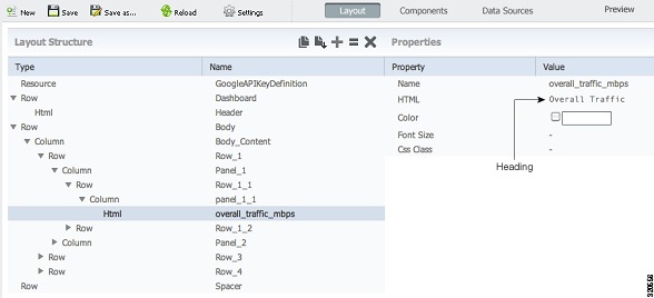
The layout, shown below, is based on a 4x4 template with an additional row added. When creating layouts for your dashboards, a good approach is to choose a template that is closest to your needs, and then customizing it.
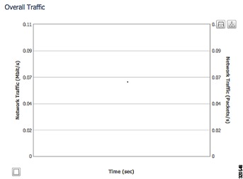
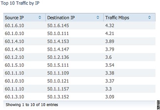
To provide uniform labeling placement, labels are placed in separate rows.In the example below, An HTML element with the text, Overall Traffic, is placed in the Row_1_1 row and panel_1_1 column, If you expand the second column: Panel_2 > Row_1_3, Panel_2_1, you will see an HTML component with the second column heading text, Top 10 Traffic by IP. If desired, you can link the HTML element to a Cascading Style Sheet so all text is displayed uniformly.
Data Source
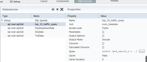
The data sources for the sample NetFlow application are shown below. The data source captured in the screen below is only for static content:
•
–
–
–
–
The data source for real-time charts are selected on the Components tab. Choose Edit Components > Real Time Charts > Real Time Line Dual Y (overall_traffic). Under Path Property, click View SQL to see a list of available continuous queries. At the bottom click ^ to select the continuous query that you want to use for the chart.
NOTE: You might have to take a few screenshots for selecting the Continuous Query datasource Data sources are defined outside the BI platform. In the sample application, SQL Queries list the data files used to simulate continuous query data. When you set up actual continuous query data sources, you will not set it up under the User Console Data Sources workspace. For information, see Setting Up Continuous Query Data Sources.
Changing Open Street to Google Maps
The following steps show you how to replace the existing Open street map component in the sample NetFlow application with Google maps. Before you begin, you need to get a Google Maps API key. The key is available from Google. See the Google website for details.
Step 1
a.
b.
c.
Step 2
Step 3
Step 4
Step 5
Step 6
Step 7
Step 8
var API_KEY = 'YOUR_ KEY'; (Your corporate/personal Google API map key provided by Google).
Step 9
Step 10
Step 11
Step 12
Step 13
Step 14
Step 15
Syslog Analytics Sample Application
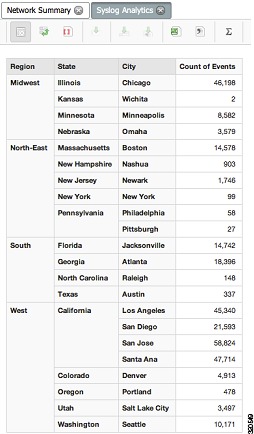
The sample syslog application shows how the Prime Analytics BI platform analytics can be used to display network data. Prime Analytics Analytics is based on the Pentaho Mondrian online analytical processing (OLAP) data model. OLAP allows you to drill into and cross-tabulate information in many different ways and from multiple perspectives.
By default, the sample syslog displays the Region, State, and City dimensions with the Count of Events measure. To add additional dates and priorities, select the Syslog Analytics file and choose Edit. In the Editing: Syslog Analytics file, add the additional dimensions:
•
•
Each added dimension causes a recalculation to occur and results are displayed in the analytics table.
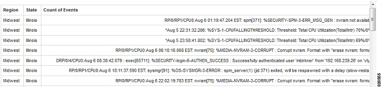
Additionally, you can drill down and display the individual syslog data records by clicking Drill Through on Cell or Drill Through on Cell on to CSV on the Analytics toolbar, then clicking the table. In the dialog, choose the dimensions you want to see, then click OK. A second table displays the details of every syslog record for the dimensions you selected.
The strength of the OLAP analytics model is the ability to consolidate or expand and drill down data in many different ways. While the Syslog Analytics sample application includes only a few dimensions and one measure, it should demonstrate the capability of analytics to show network data in a variety of ways.
Syslog and NetFlow Live Sample Application
The Syslog and NetFlow Live Dashboard sample application allows you to view simulated live NetFlow and syslog data, then connect the sample to your NAM and NGA devices and generate live syslog and NetFlow traffic to the sample dashboard.
The NetFlow Syslog Live Dashboard sample is located in the Samples/NetFlow Syslog Live directory in the User Console directory. The sample provides the following data:
•
•
•
–
–
The data is displayed using a dashboard comprised of the Real Time Line Dual Y and Real Time Column chart components. (For information about creating and editing dashboards, see Chapter 5 "Creating Dashboards.")
The NetFlow and syslog data streams are installed on your TruCQ engine. The schema can be viewed in the following location:
$PA_HOME/biplatform/sampledatagenerator/netflow_namsyslog/customizations/db/ nfsyslog.sql
The Syslog and NetFlow Live Dashboard connectors are installed in:
$PA_HOME/biplatform/sampledatagenerator/netflow_namsyslog
You can change these data sources as needed to ensure the fields that are consumed match your input.
Configuring the Syslog and NetFlow Live Dashboard for Live Data
Complete the following steps to connect the Syslog and NetFlow Live Dashboard to NAM and NGA devices generating syslog and NetFlow traffic on your network:
Step 1
$PA_HOME/biplatform/sampledatagenerator/netflow_namsyslog/customizations/templates/include
-handlers.xml.
Port 514 is the default NAM syslog port; Port 3000 is the default NGA NetFlow port.
Step 2
$PA_HOME/biplatform/sampledatagenerator/netflow_namsyslog/customizations/templates/include
-handlers.xml
Step 3
$PA_HOME/biplatform/sampledatagenerator/netflow_namsyslog/syslog_parsing_rules.xml)Step 4
Step 5
Step 6
$PA_HOME/biplatform/sampledatagenerator/netflow_namsyslog
Step 7
$PA_HOME/bin/pa_env.shStep 8
$PA_HOME/bin/build-local.sh
Note
Step 9
$PA_HOME/bin/start.shThe connectors begin listening on the ports configured in Step 1.
Note
Note
Step 10
Step 11