
 Feedback
Table Of Contents
Overview to Prime Analytics Dashboards
Navigating the Dashboard Workspace
Setting Up the Dashboard Layout
Working in the Layout Workspace
Adding Components to Dashboards
Working with the Components Workspace
Adding Data Source Queries to Dashboards
Working With the Data Source Workspace
Adding Charts for Real-Time Data Sources
Improving Dashboard Performance
Creating Dashboards
The following topics tell you how to create and manage Prime Analytics dashboards:
•
Overview to Prime Analytics Dashboards
•
•
•
•
Overview to Prime Analytics Dashboards
Dashboards allow you to display your data in many different ways so that you can interpret data quickly and effectively. Prime Analytics dashboards are built using open source components and applications, including the Pentaho CTools framework. CTools applications and tool sets include
•
•
•
•
Pentaho CTools information and documentation is available from the Pentaho Community website: http://community.pentaho.com/.
Creating a dashboard in Prime Analytics is accomplished using the following processes:
1.
2.
3.
4.
The steps can be completed in any order. In fact, beginning with a basic dashboard and then adding additional components and interactivity works best as you gain experience.
Navigating the Dashboard Workspace
To launch the dashboard workspace, from the File menu, choose File > New > Dashboard.
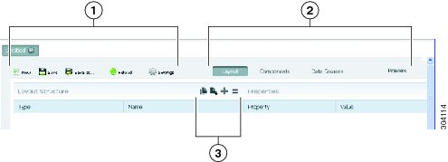
The dashboard workspace appears (Figure 5-1). The workspace has the following general components:
•
–
–
–
–
–
•
–
–
–
–
•
Figure 5-1 Dashboard Workspace
Creating a New Dashboard
In the following procedure, you will create a new dashboard and set up the dashboard layout.
To create a new dashboard:
Step 1
Step 2
a.
b.
Step 3
A new dashboard is created.
Step 4
Step 5
a.
Note
b.
c.
d.
Step 6
Your new directory is displayed in the directory where you placed it.
Step 7
Step 8
Step 9
Note
Your dashboard appears in the work area with dashboard edit tools available. The dashboard tab name is Edit: dashboardtitle.
Step 10
•
•
•
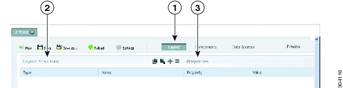
Setting Up the Dashboard Layout
When you first open a dashboard, the layout area is displayed with an empty layout (as shown in Figure 5-2). The layout workspace consists of two areas, Layout Structure and Properties. Layout Structure displays the current layout design. Properties displays the properties of the element currently is selected under Layout Structure.
Figure 5-2 Layout Workspace
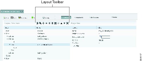
Figure 5-3 shows the Layout workspace with a simple page design. The left pane shows that the page is divided in three rows labeled Header, Contents, and Footer. The Header row is a simple row containing no elements. The Contents row has several elements. These elements are expanded. You can expand or collapse elements by clicking the triangle located to left of the row element. In the example, the Footer row is collapsed. The triangle in front points to the right, indicating that this row contains collapsed elements.
Figure 5-3 Dashboard Workspace With Sample Layout
Layout Toolbar
Use the layout toolbar to customize your layout. The toolbar is dynamic, and displays between two to eleven tools, depending on the layout objects that you select. Actions that you can perform include:
•
•
Note
•
•
•
•
•
•
•
•
•
Layout Properties
Layout properties also vary, depending on the element that you select. The first property in Figure 5-3 is Name. This property sets the element name. This name is shown in the Name column of the layout structure as well, and can also be used to attach components to the layout cells. You can use any alphanumeric character in a name. Underscores (_) are the only permissible special character in a name.
The dashboard layouts are based on the blueprint.css stylesheet. To minimize the need to manually adjust widths, blueprint.css divides a screen into 24 columns. If you create a column in the layout workspace it has three blueprint.css parameters:
•
•
•
The layout workspace width is set in blueprint.css columns. Although you can force the width of a component in pixels in the component view, it is not recommended. The recommended practice is to leave the component width empty so its width can be determined from its contents and the cell layout (<div>) where the component is placed.
If the combined width of the columns on a line exceed the page width, the columns that do not fit are wrapped to the next line. The blueprint.css does not provide a height requirement. Column height is based on the height of its contents. Therefore, an empty column is invisible as it has a height of 0 pixels (unless you explicitly set the column height). For more information on the blueprint.css framework see http://www.blueprintcss.org.
Color Editor
Layouts include an option to set the background color property of rows and columns.
To set the background color:
Step 1
The color editor is displayed.
Step 2
Step 3
Step 4
Note
Working in the Layout Workspace
As you work with the dashboard editor Layout workspace, keep the following in mind:
•
•
•
•
Adding Components to Dashboards
After you set up your dashboard layout (see Setting Up the Dashboard Layout), you can begin adding components to it. A wide range of components are available, from scripts and charts to buttons and maps. Familiarizing yourself components will take time. These topics will provide a general overview.
To add components, within a dashboard, choose Components.
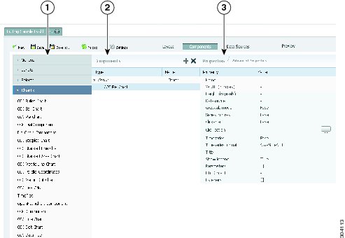
The component workspace, shown in Figure 5-4, is displayed.
Figure 5-4 Components Workspace
This workspace has three areas. The left area displays components classes containing components that you can add to your dashboard. The middle area shows the components that have been added to the dashboard, and the right area shows the properties of the components selected in the Components list.
Component Categories Area
Available components are divided into eleven categories: Generic, Scripts, Selects (#1), Charts, Others, Widgets, Real Time Charts, Community Contributions, CDF Core Functionality, Custom, and Selects (#2). Many components are provided with the Pentaho Community Tools (CTools) application. Pentaho CTools acronyms referenced in the components include:
•
•
•
•
For more information about Pentaho Community Tools, see http://community.pentaho.com.
Dashboard components provided with Prime Analytics include:
•
–
–
–
•
Note
•
–
–
–
–
–
–
–
–
–
–
–
–
•
–
–
–
–
–
–
–
–
–
–
–
–
–
–
–
–
–
–
–
–
–
–
•
–
–
–
–
–
–
–
–
–
–
–
–
–
–
–
–
–
–
–
–
•
•
–
–
–
–
–
•
•
•
–
–
–
–
•
Components Area
The selected components area shows the components that you added to the dashboard. These component are grouped by category. In the example in Figure 5-4, one component is added, a CCC Pie chart that belongs to the group charts. The middle pane has a dynamic toolbar. Two tools are shown: Duplicate Component and Delete. If more charts were added, the Move Up and Move Down tools are added.
Properties Area
The component properties area shows the properties of the selected component. Next graph shows component workspace. The available list of properties is already fairly long. For the CCC Pie chart in figure 6 this list contains 15 properties that can be set. If you click Advanced Properties, the advanced properties are added to the list. Properties that appear for many components include:
•
•
•
•
•
•
•
Adding Charts to Dashboards
Below are the general steps associated with creating a chart:
1.
2.
3.
4.
5.
6.
7.
8.
If you are new to charting, here are guidelines that may help you determine what type of chart is best suited for the data you want to present in your dashboard:
Bar Charts
Bar charts are useful when comparing items during a specific time period. Key words to think about when creating a bar chart are compare or rank. For example, if you want to compare items sold to show which one made the most profit, you can create a bar chart that ranks the products from the lowest to highest profit. The bar's length determines its ranking; the label identifies the item. Bar chart data can be presented horizontally or vertically depending on your requirements.
Pie Charts
Pie charts are useful when comparing parts of a whole. Key words associated with charts include, portion, share, and percentage. For example, if you want to demonstrate the proportion of the company's budget spent on health insurance, use a pie chart. To make the chart easier to read, limit the number of slices to five. Pie charts can also be exploded, which means certain slices are pulled away from the remainder of the chart for emphasis.
Line Charts
Line charts are useful for showing changes over time. Key words associated with data that is best suited for a line chart are trend, growth, and decline. If, for example, you want to show how product sales have changed over five years, use a line chart. The slope of the line helps users quickly identify the direction of the trend.
Dial Charts
Dial charts are often associated with Key Performance Indicators (KPIs). Dial charts are circular and contain a scale, a needle, and one or more a dial sectors. The dial sector is used to identify a specified area on a dial chart using a particular color. For example, you could have a dial plotting inventory with a minimum dial value of 10000 and a maximum dial value of 50000. There could be a red dial sector for the region between 2000 and 4000 indicating that if the needle is in this area, there is a danger of a supply inventory shortage.
Area Charts
Area charts can be used to show a comparison of the same item during different points in time. Area charts are not designed to provide exact data; they provide users visual clues of the relative sizes of the items they represent.
Real Time Charts
Prime Analytics includes real time charts designed for continuous query data. These include:
•
•
•
•
•
Working with the Components Workspace
Most properties have an auto-completion function. When you edit such a property, a list pops up containing the available options. The list is context-sensitive. For example, if you click the HtmlObject, a list of all layout containers appears. However, if you click the parameter property, it will show a list of defined JavaScript variables. (This list will be limited to the JavaScript variables that you defined using the parameter components. It will not include parameters defined in your own JavaScript resources that you included in the dashboard editor.) When you enter a property value, the dashboard editor only does a basic validation. If you include a value that does not exist, the editor might not raise an exception. Also when you preview a dashboard, the editor might not call out errors. The only notification you might get is when your component is not drawn. Therefore, use the auto-completion function whenever possible. Most components have many properties. If a component fails, you might need considerable time to track down the property value that you misspelled.
The dashboard editor does not consistently warn you when you make an error in a component. The main error message is the failure of component render on the screen. Therefore:
•
•
Adding Data Source Queries to Dashboards
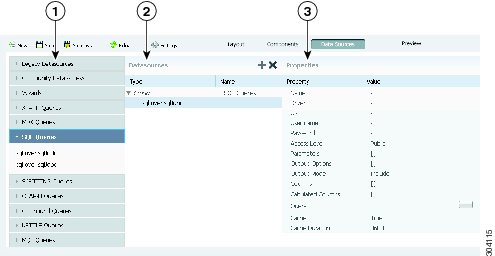
The Data Sources workspace, shown in Figure 5-5, is where you add the data source queries to your dashboard components. The Data Sources workspace has the same layout as the Components workspace. Available data source queries are displayed in the left area, the middle area shows the data source query that you have created for the dashboard and the right area shows the properties of the current selected data source query.
Note
Figure 5-5 Data Sources Workspace
Available Data Source Queries
The left area of the Data Sources workspace displays the data source queries and other processing that you can add to the dashboard. These include:
•
–
–
–
–
•
–
•
–
–
•
–
•
–
–
–
–
•
–
–
Note
•
–
•
–
–
–
–
•
–
–
•
–
•
–
Data Source Area
The Data Source area in the middle of the workspace shows the current data sources defined for the dashboard. Above the data source list you have the same dynamic toolbar as described for the components workspace, allowing you to delete or duplicate data sources, or move them up or down.
Data Source Properties
The Data Source Properties shows the selected data source properties. Properties that appear for most data sources include:
•
•
•
Note
•
•
•
•
•
•
•
Working With the Data Source Workspace
The dashboard editor does not check your queries for errors. If your query has an error, the query usually fails. Errors returned by the database engine are not shown to you. The only feedback you receive is the failure of the component using the data to render. Therefore, the following practices are recommended:
•
•
–
–
Adding Charts for Real-Time Data Sources
Complete the following steps to add data sources for real-time components:
Step 1
Step 2
Step 3
Step 4
Step 5
Step 6
•
•
•
•
•
Step 7
•
•
•
•
Step 8
Step 9
Step 10
Step 11
Step 12
Note
Improving Dashboard Performance
As you work with dashboards, you might find the need to improve performance in certain situations. The following provides some performance improve dashboard performance, For example, to retrieve records you use: select cq_close(*), count(*) from event <slices '5 seconds'>. Each time you get 2000 records. To make this more manageable, use an advanced property on the user console to set the maximum number of data points to plot. If you set it 20, it will show 20 records each time.
Because 2000 is much more than 20, a performance issue might arise. To solve this, add a limit to the SQL, for example, select cq_close(*), count(*) from event <slices '5 seconds'> limit 20. However, setting the limit to 20 means you cannot see 90% of the records. While no ideal solution exists, to see more data you can increase the maximum number of data points to plot, for example, 100. However, if this setting is too large, individual data points might be difficult to see on the dashboards. Ultimately, you will need to find a balance, so experiment to find the best balance.
Another performance improvement suggestion is to remove charts that aren't used. For example, you add a static chart, such as a pie chart, to a component. You might also add a JDBC data source component to the chart. You might later decide you don't want to see the chart show and remove the HtmlObject relation, such as Panel_1, from property while leaving the chart still in component.
The next time you run the dashboard, the chart will not be visible. However, it will still have a performance cost because of the JDBC data connection. Therefore, if you decide you do not want to display a chart, always delete it from the component to avoid drains on performance.